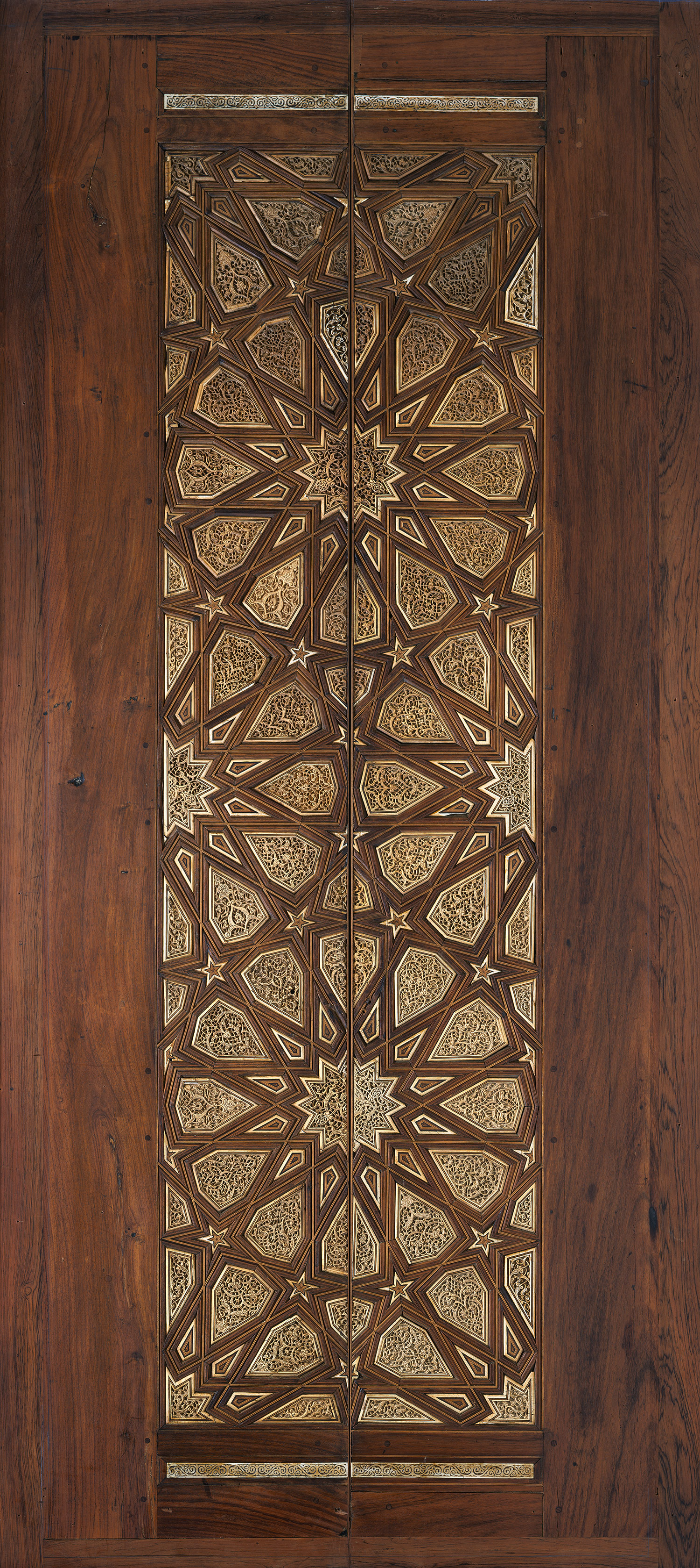
"My God...it's full of stars!"
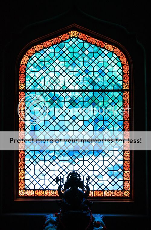
A few other inspirational photos:
a) I'm surprised to find I like this so much, given the rectangles instead of diamonds -- this one is in real contention now (although I wonder if I'm being overly-influenced by the pretty garden behind it):

b) Don't like the border, but the center motif is pretty:

c) I think it may be the blue that is swaying me, rather than the actual pattern:


Mary Anne,
Once you determine whether you want opaqueness or transparancy so you can see the garden, then the choice of screen effect (photo 1) or window muntins (photo 2) should be easy. The advantage of these repeating patterns is that once a module of x veticals by y horizontals is determined you could make a number of assemblies quickly.
I see the real craftsmanship in the border by taking elements of photo one which are translucent and emphasising the work around the little stars. As you can see the glass elements have a pattern etched into them. The center main field would be more like photo three. Photo 2 is too grillage like and photo 4 is two busy for a window although I like the two colors.
Yeah, I guess that once the dust settles and you are in the house you can persue adding an insert to the kitchen window. Heh, heh, as if the dust will ever settle from your schedule.
Many pretty ideas and I don’t have a real opinion right now. The only thing I’d say is that I’ve been surprised how much light is blocked by dividers in windows, so if you want it really light, make bigger panes with less leading. Of course, I don’t remember the other windows in the area, so I don’t remember how much light you need 🙂
The Egyptian mosque pattern is lovely.
I’m not so thrilled with (a); I like diamonds better. (b) isn’t bad, but not really grabbing me. I too am swayed by the blue in (c); the pattern’s fine, but I think I’d rather see that blue in a plain diamond pattern.