Colors: Blueberry (blue), Seduction (purple), Night Flower (red)
I quite like this color combo -- it looks like something out of a fairy tale to me, without being too cotton-candy-ish (as the vast majority of Victorians seem to be). Just looking at it makes me happy. It's totally okay if it makes you want to claw your eyes out -- you don't have to live in it! Or even see it! Unless you're our neighbors -- hi, Ron and Liz! It could be worse -- I could've picked blue/orange, like this Victorian, or maybe yellow with two shades of red.
Of course, Kevin may also decide he wants to go a little more subtle. Which would be okay with me too -- not quite as much fun, but perhaps easier to live with?
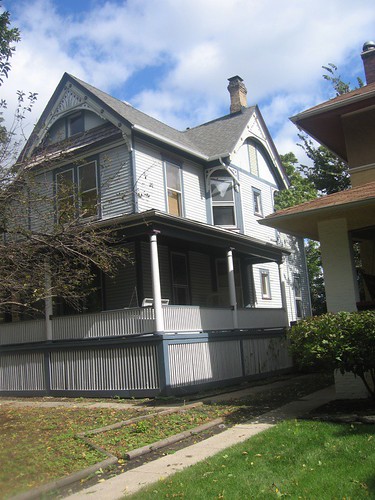
This is what our house currently looks like. So all that light blue-grey would be replaced with a rich blue:


Hi Mary Anne,
I’ve just been having fun playing with Benjamin Moore’s Personal Color Viewer with the demo house that you picked to paint. If you like Blueberry (and as I said, that’s my favorite too) try looking at it with Cupid’s Dart for the trim color and Cinco de Mayo as the accent color. I think the colors are rich enough to not be too pastel-like, but a little more “contemporary casual” rather than the accent colors you on your sample: seduction and night flower.
And yes, people around here tend to paint big-box colonials mostly in white or yellow, but they go for Athens blue or something similar if they want a change of pace that doesn’t look too strange.
Occasionally, they go for Chicago Blue on a Colonial, like the builders in our condo complex, and then it’s so bland that our recent touch-up replacement shingles were done in grey as the closest match.