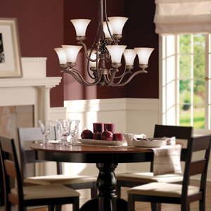
If you're having trouble imagining an eggplant dining room, it might look something like these lovelies:
Minus the bright white, which neither of us like (too modern) -- (and note the Chinese blue vase on the dining table; this will be relevant later in this post):

The photo claims the walls are aubergine, though they've photographed more red; I like the feel of this room, very homey:

Minus the red curtains, I think:

Not lacquered all shiny:

This is a nice easy-to-live-in room:

This one is cute (although also a lot of white):

This is a bit Hollywood glam for me, but I like some of the colors:

And okay, this isn't a dining room, but I think this room is just GORGEOUS -- I would love my house to have this feel overall:
So Hague Blue and Brinjal would give this sequence:


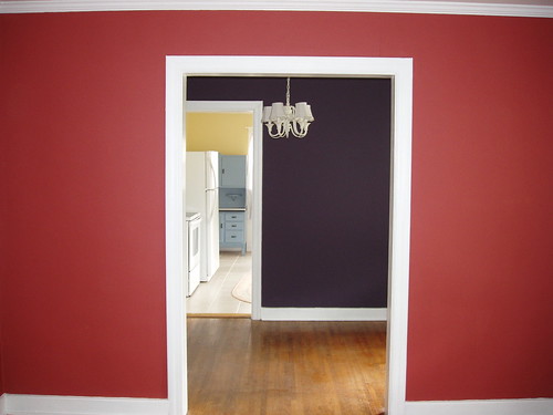
But then what for the front parlor? We'd thought a red, but somehow, all the reds we've painted look odd next to Brinjal -- too close, maybe. Although someone did it here and it looks okay. I think their purple is less red, though.

If we didn't do red, then what should go next to the brinjal? Color suggestions to pair with aubergine include cool blues, greys, mustards. We're not big yellow fans in general. Do you think any of these would work in a room which doesn't get a ton of natural light?
Chinese Blue (this is what I've been imagining for the front room from the beginning, but I think Kev is unconvinced):


Castle Grey (Kev likes this color, but it's a little green for my tastes):


Down Pipe (maybe too dark in that room -- it looks darker on paper than on screen):


Those are strong tones -- if we went to mid or light tones, we could do something like this silver grey -- but would that be too strong a contrast, and too jarring?:
Skylight:


what about the incarnadine for the front room?
I like the Chinese Blue very much, but Skylight is what I’ve been dreaming of painting my bedroom ever since you posted a link to the paints.
(I am in love with their paint names. I have a terrible yearning to paint something Dead Salmon just to say I did.)
Catherine, I’ll try it again, but when we put the sample sheets next to each other, all the reds look too close to the brinjal, sadly. That was our original thought.
And Kathleen, yes — the dead salmon name is fabulous. Maybe an end table? 🙂
I do agree that Down Pipe looks too dark and Skylight looks too light (on screen). Can’t you just ask them paint place to darken one or lighten the other and get them to recommend which one you should do?
I know when we to Benjamin Moore they were super helpful and often paint places can duplicate another shade you love from another line if you feel it works better….just a thought? Usually higher end paint places are super helpful. Put them to work!
Lakshi, we’re using this weird clay paint — everyone agrees that BM can’t effectively match it. BM may be coming out with a clay-based line, but not soon, sadly.
As for your other comment about doing it piecemeal — that makes sense, except that at this point, we just want it all to be done. Even if we try to do that, there’s still going to be two months of punch list stuff after we move in regardless, which is a pain to live with given small children and dog. I think we want the painting at least to be done. 🙂