
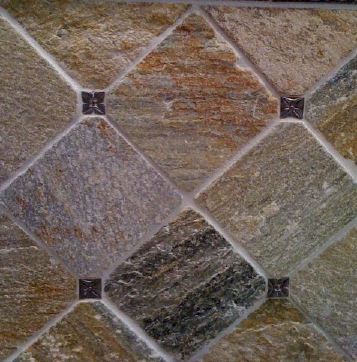
The color is hopefully a good compromise between Kevin's and my tastes. He's drawn to the warm tones -- beige and tawny and taupe. I love the cool tones -- dark grey and blue and green. The quartzite is medium-toned, and has all those colors playing through it. I think it's going to end up really pretty, especially set in diamonds (like above) enclosing the fairly large shower space.
The rest of the bathroom will be dark wood floors, pale bone-white walls, dark wood vanity, white raised bowl sinks and white toilet, and a clawfoot tub that came with the house that we're refinishing. I think we'll do the clawfeet themselves in a coordinating nickel silver (ditto fixtures throughout), but haven't yet decided what color to paint the tub itself. Stick to classic white? Or use a color, like a pale grey-blue that might pick up some of the quartzite tones? We also still need to choose lighting. Overall, I'm aiming for a spacious, serene, nature-inspired room.
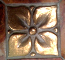
The quartzite tile will be studded randomly (as we can afford it) with a few accent tiles in worked metal from Bronzework Studio, like the ones pictured above, but spaced out a lot more. We picked this piece below for the accent, but you need to imagine it in a dark silvery tone (like the metal tiles above), what they're calling white bronze, which looks like nickel silver in tone. The tile name is blooming leaf; it looks like dogwood to me (and to Kirsten, who came along for tile selection that day).
Gods, it is such a relief to have this done. On to the guest bath -- where we are still debating shower vs. normal tub vs. 55" clawfoot (existing) vs. 48" clawfoot (purchase, but would let us re-use 55" tub in master bathroom rather than puchasing a new one for there). The shower, it turns out, is a notably more expensive option, once you factor in construction costs + tile. But possibly still better for guests, especially elderly or disabled guests. I'm leaving this decision up to Kevin; he needs to come up with a final answer by the weekend because we're doing our walk-through with the plumber on Tuesday next week, and should know where the fixtures are all going by then.