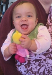
 Kavi has recently figured out what a dolly is for. This is one of her HABA dolls, a pink princess from the Dragonstone castle set. She gets in moods where she carries it everywhere. She even holds it in her hand while crawling across our wood floors, which makes it notably more difficult to crawl, but apparently she does not care. I think it is awfully cute. She also likes carrying her purple monster and her paisley elephant and her blue knight, but the princess appears to be her favorite.
I'm relatively pleased with progress on the new website. The main things I need to figure out still:
- how to make the left column color go all the way down
- how to make the book covers scroll (javascript stuff, apparently)
- how to grab a new photo for the top right (I think Jed can do)
I think, if I understand CSS correctly, that I can go ahead and start modifying other pages, though. Because when I fix those two things, I'll be fixing them in the css file, and the changes will take effect across the site. Which is cool. And I suppose the whole point of CSS. :-) So if Kavi allows me today, I'll be working on that, off and on. Also drafting my syllabus. Website and syllabus -- you'll be hearing a lot about those two things in the next week, I think. Next quarter starts on the 31st. Eep! Lots to do before then...
Word is starting to come back on the nonfiction book, by the way. A few people have read it and liked it, yay! My main workshop group isn't until 4/13, but it's awfully reassuring getting the early responses. They do, of course, have suggestions for improvement...but that's what first readers are for, right?
8:00 update: Hmm...well, it didn't take long to make two new pages for the site -- but I've run into a bit of a snag. Because either I give everything temporary filenames (which makes links and browsing not work so well, and also makes me nervous that when I make it all live I'll have to do a whole lot of renaming and will mess something up royally in the process, or I use the real filenames, in which case the site is going to look pretty schizophrenic for a while, with both designs active in different parts of the site. I think I'm inclined towards the latter, actually, goofy as it seems. Hopefully I can get the bulk of the site switched over quickly. If you have an opinion, let me know asap! :-)
9:20 update. Wait, no, I was wrong. The left column thingie is in the CSS, but I think the photo grabbing may not be. And I'm not at all sure about the javascript. Sigh. Must ask Jed. Anyway, those two pages are changed now on the site, and they have gazillion not-yet-operational links, so let the chaos reign...

Some thoughts:
I’ll set up a random-photo-picker thingy (should be pretty easy), but I’ll need to talk with you about some details. I’ll call you soon.
I thought about the Post Comment link; not too hard to add, just wasn’t sure what you wanted the model to be. Do you want the front page to be a primary way of interacting with the journal, or just a quick way to see the latest entries (with the expectation that they’ll click through to the main journal pages to post comments or navigate through the journal)?
Before you do too much more with the site, I’d recommend moving your CSS file into a subdirectory. Call it “includes”, or “_includes”, or “assets”, or “css”, or something along those lines. Just helps keep things in one place, especially if you later add other CSS files.
I would recommend being pretty sure of the overall layout/design/look before you apply it to the whole site — CSS does let you make sitewide changes easily, but there are some things (esp. whole-page layout issues, but also potentially stuff like the left-column color going all the way down) that won’t be easy to change with CSS tweaks. So I recommend doing a few sample pages to get the design close to final before you start applying it to the whole site.
Also, it may be possible to use a sort of glorified search-and-replace (or maybe even DW’s ordinary search-and-replace) to automatically apply the new look to a bunch of pages at once, depending on how consistent you’ve been in the past with your coding.
Mary Anne, for whatever it may be worth, I really like the current format of your journal much better. I like the fact that I don’t need to spend a lot of time scrolling to find an entry the way I do on blogspot blogs, livejournal blogs, etc. Your index of first lines is a wonderful idea. I so hope you don’t discard it.