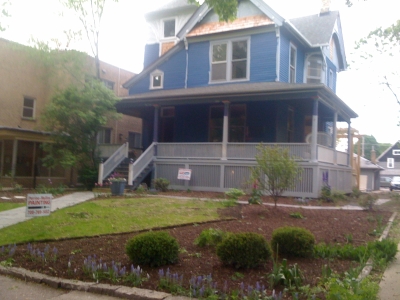
We're wondering if we should go a color darker, to Old Navy, which makes me fret that it's going to look gloomy and black, especially on grey days. There are some very dark houses in our neighborhood, and they look lovely and elegant, but also, y'know, dark. Is that a good blue in the middle there? Or too dark? (Just one coat.)

And we'd thought we'd do dark blue body, purple trim, with green and pink accents, very spring-like in theory. But practice, I kind of hate the green and pink next to each other -- looks carnivalesque. (See photo at bottom.) What's acceptable and lovely in flowers is apparently not so much so on the side of my house.
Partly because it's a pretty big house -- if it were small, I think we could maybe get away with brightly-colorful, with a sprightly cottage feel. (Also, if the house were in California or Florida, which somehow seem better suited for that kind of color scheme. The Midwest is more...serious. It's the six months of winter, y'all.) Given the size, I worry it would feel like shouting look-at-me to the neighborhood, and I'd rather go for something that seems richly-colored, but still relatively quiet and serene. Does that make sense? (The house across the street has seven colors, but they're all...ugh, I don't know the word for what I mean. They're not bright. There's pink and yellow and green and dark red and orange, but they're all a bit...muddy? It works. It's beautiful and colorful but not shouty.)
And the painter is pushing for a porch that 'pops' and lord, I hate the word pop at this point. I don't want anything to pop. I want a lot of colors, but I want them to be to harmonize in subtle ways, which I think means three colors near each other on the color wheel? An analogous color scheme, rather than complementary? Why do I find color harmonies so confusing?:
"Analogous color schemes use colors that are next to each other on the color wheel. They usually match well and create serene and comfortable designs. Analogous color schemes are often found in nature and are harmonious and pleasing to the eye....Choose one color to dominate, a second to support. The third color is used (along with black, white or gray) as an accent."

I think that means I should go with either:
a) blue, purple, dark red, grey, OR
b) green, blue, purple, grey
I know I like the Raisin Torte (dark red) against the blue and the purple, but have completely failed to find a green that works (after trying a solid dozen greens). Balsam is okay, but not great. Argh.
Colors almost finalized: Old Navy (or Down Pour Blue?), Blackberry Wine (or Deep Mulberry?), Raisin Torte
Colors to try: Hunter Green, Forest Green, Evening Dove, Dark Burgundy
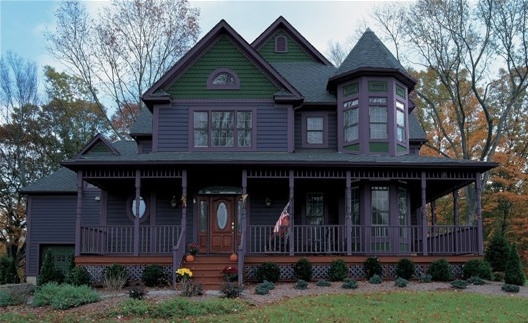
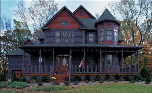
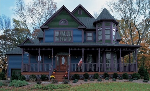
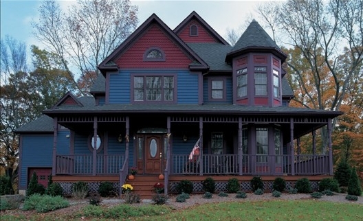
These are not my houses below, and screen colors are misleading, but to give a vague idea:
Old Navy, Blackberry Wine, Hunter Green:

Old Navy, Blackberry Wine, Raisin Torte:
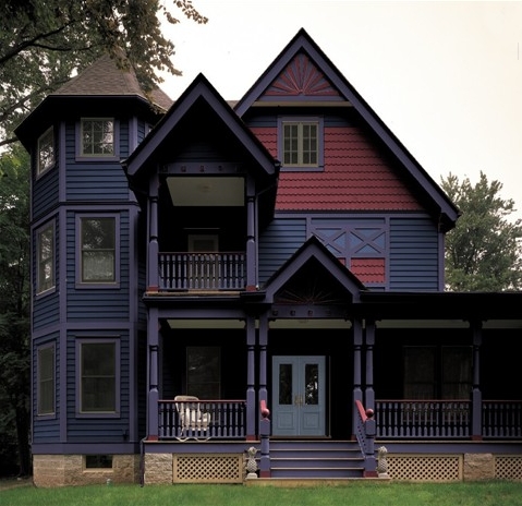
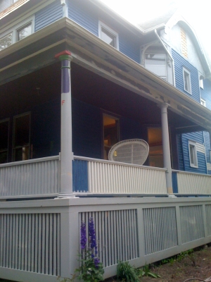
Here's the house with parts primed (light grey) and parts unprimed (white), if that helps. I'm not sure why it would, but I'm desperate. Also, in this pic, you can see the pink and green against each other.
Pam just e-mailed that she drove by last night and thought the darker blue didn't look as good. Ugh, so confused. If we go back to the old body color:
Down Pour Blue, Blackberry Wine, Hunter Green:
Down Pour Blue, Blackberry Wine, Dark Burgundy:
8:20 update: Okay, I'm trying to keep the body in the original blue, the trim in the original purple, and a few other accent options, in the blue/purple range, per your suggestions. (THANKS!) How are these? (Try to picture them a little brighter; I think that's more true to life than the color viewer suggests. And all with a light-to-medium grey for the fourth color, I think fairly similar to the primer color, maybe a shade or two darker?)
a) Down Pour Blue, Blackberry Wine, Darkest Grape:

b) Down Pour Blue, Darkest Grape, Blackberry Wine (reversed trim and accent):

b) Down Pour Blue, Blackberry Wine, Blueberry:


Maybe the pink and green need to be a shade darker. I’m not fond of the navy, its too dark… I like the downpour blue though!
I do see your point about the pink and green… and maybe those need to be darker?
Signed
trying to figure out colors for my own house… understanding your pain!
Hi dear,
Congrats on the move! Been meaning to say that I read your blog a lot but I usually don’t comment because frankly I don’t know the difference between brass and bronze, sconce and scones (well maybe that one I know… did someone say raisin?) and most of the other decisions you’re making.
But colors, I do know. Or at least have strong opinions on.
I think the blue on your house is lovely (in a Midwestern, not California, kind of way — in California I would give you totally different advice)). It does not look like any kind of blueberry to me. And I think the houses you show with the Old Navy color look gloomy. They are kind of solid and formal to look at, elegant I guess, but I feel like they’re too imposing and personally I wouldn’t want to live inside that color. Note that your house also has a roof that appears to be a lighter color than the roofs on those houses, and you need your blue to support that, otherwise the roof will look very bright on top.
Want to try again with the color wheel? Ok, so under the link you gave, the category you want is “analagous,” yes? (And you know why? Because you’re saying you don’t want “vibrant” which is what most of those other combos do, in various ways.)
So your blue is the middle of the three blues, imho. Since you want to darken up the look, choose for your trim/etc the colors up to the left — that’s the darker blue, and then the first (darkest) purple. So there are your 3 colors; I think in your paint terms they would be down pour blue, old navy, and blackberry wine.
Add grey, or maybe black if you want to darken the look further (but I think grey, again because of the roof), and you’re done.
You are having a problem because you’re trying to go too far in opposite directions along the color wheel, toward both the purple and the green. That isn’t really going to work. (Yet you’re not going far enough to make a nice rectangle or triangle, because you don’t want “vibrant.”)
Plus, greens are notoriously uncooperative, it’s hard to get a green to play well with other colors that aren’t really neutral. To use a green well, imho, you have to choose the green first and then work around it.
I agree that the red is nice but if you don’t want anything to pop, maybe not. Or use very sparingly. Too much of that red with the down pour blue will give it sort of a weird Americana look. Then you’ll have to put a flag out front and bake stars-and-stripes cakes every 4th of July.
I don’t know what the other purples you mention look like, but maybe one of those as a sort of accent, instead of the red, would work. It should be close but just a bit brighter — think of it as the next color up on the color wheel — just ONE step though, not any further.
Whatever you do, stay away from the pink-green combo. That never works. Besides, that green you have in the test strips is way too light for your blue anyway. Let the garden take care of the green.
I am personally biased against pink on houses so I will say no more on that topic.
By the way, the inside colors look gorgeous. Big win.
keep the downpour blue. Find different trim colors. Its a great blue, you just need to find the right trim. Maybe stick with purple, blue and white. Make it all kind of one gradient. Just a thought.
These all look OK to me, but I am passionate about yellow/dark brown combinations on houses, so none of these really excite me.
I like the middle one. The colors harmonize, not too dark not too light, but the trim etc stand out so the shape and complexity of the house are apparent. And I agree with staying with the downpour blue. I think you’ll adjust to a “too bright” blue faster than you will a “too dark” and it will darken as it weathers so if you start out too dark … (although it doesn’t look too light to me but I’m from Miami!)
I do like the last three images. no opinion on which is better. I think trying to get green in there or that burgundy is trying too hard. Just my opinion, of course.