Here's George, our tile guy. Say hi, George!

I guess he's too busy. Better not disturb him, because when George gets going he turns out beauties like this (Porcelanosa's Deco Silk Blanco tile):

We had thought about a tiny clawfoot, which would have looked charming, but practicality won out -- especially since we expect to have elderly and child guests, having a reasonably low wall for them to step over seemed more important. This one is 14" high. The 5' wide tub also allows more soaking length than a clawfoot (which would have had to be notably shorter to allow sufficient clearance around it). We'll be adding a grab bar which will mar the aesthetics slightly, but again, will be more practical for guests. And practicality and comfort is obviously more important in a guest bath! The tub is cast iron, like a clawfoot, so it should retain heat much better than a regular tub. (Kohler Villager)
My only concern about this bathroom (aside from how tiny it is) is that the window doesn't open. I'm generally a big fan of operable windows in the bath. But we have a good exhaust fan in the ceiling to help air it out, and that wall faces directly onto the apartment building a few feet away; Pam argued that guests wouldn't want to be opening the bathroom window onto that. Hmm...I'm not entirely convinced -- we could have done an obscure but operable window, so they'd at least have the option of opening it. But this does look cleaner. Oh well -- too late now.
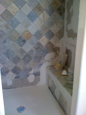
The tile in the master bath shower is much simpler -- a basic quartzite tile (slate variant), very cheap! I wanted something with a bit of a medieval castle feel in here, and after considering and discarding many options (Kev didn't like protruding brick style, for example, and I don't like yellow-ish stones), I'm really happy with the final result. The quartzite has really pretty color variation, but is lighter and warmer and subtly sparklier than slate. Setting it in diamonds makes it feel even more medieval. And we splurged on just six accent tiles (Bronzework Studio's Blooming Leaf in white bronze), which I just love. They're a little feminine, but not overly so, given the heavy, solid metal in which they're worked. Beautiful.


Again, I have window issues -- this time, I agitated for and finally received (after MUCH argument) a window inside the shower. I love the open-air showers in Sri Lanka, and when the weather is nice, a little fresh air in the shower is a wonderful thing. And this window faces onto our backyard, with the nearest neighbors a decent distance away (especially since the window is set high enough to screen any naughty human bits inside the shower). BUT, my architect and contractor united to insist on a vinyl window in the shower, for avoiding leaks and water damage, I guess. SIGH. It bothers me aesthetically; it bothers me mightily. An old Victorian house should have wood windows -- this is the only vinyl window in the house, and I wonder whether I'm going to regret it. We'll just have to live with it for a while and see.
We still have to choose the countertop for the master vanity (below), which I'm a little confused about.
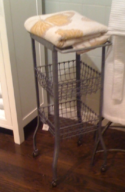
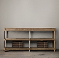
It originally came with a Carrera marble countertop, and we could have bought the base and counter together, but Pam said we could get the stone top for half the price from her guys. Cool -- we just ordered the base. But now we're not sure we actually want a marble top. Here are the elements of the room -- the quartzite tile and white bronze accent tile shown above, a light weathered oak washstand, a white clawfoot tub (which we may paint grey on the exterior, or might leave white), the Indian mirrors pictured below (Nadeau), and possibly the little storage rack pictured (a pic I took at Pottery Barn a few weeks ago, but oddly, I can't find that piece on their website). But that's the look we're thinking of, sort of a mix of medieval / industrial.


Given all that, would you do the countertops in:
- white marble with grey veining
- quartzite slab (same as the tile, essentially, but all one piece)
- zinc (would weather to dark grey)

It's funny how some things turn out perfectly, exactly as I envisioned them and just beautiful. And others, not so much. Pam's guys put in the oak beams on the ceiling (still need to be stained dark brown) and tried adding a little star -- and I hate it. It just looks tiny and flat and cutesy and out of scale and wrong. It might be okay for a kids' playroom, but it doesn't have the necessary gravitas for my study. I'm not sure how to fix it, but I think maybe it would need to be three-dimensional in some way? Or maybe I abandon the star idea and just suspend a sphere? I don't know, but this, it is not working. Help!
Also, I am fretting about that blue on the ceiling. I love it as a color, but maybe it's too jarring a transition between it and the off-white walls? Not sure not sure not sure. Help help.
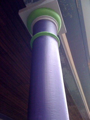
On the other hand, I LOVE the blue and purple we picked out, now that they're on the house. BM's Downpour Blue and Blackberry Wine. Yum. Like getting drunk in the rain on a summer day.


On the third hand (or is that fourth or fifth or seventeenth?), the green the painters suggested for an accent is not working for me. (Pam agrees.) Too limey. We're going to have them try the same color a shade darker; I have high hopes for that.

Here's my last mistake of the set. I'm sure you don't remember, but I was so excited when we bought the house in fall of 2009 that I somehow managed to go out there and plant some bulbs along the front walk. Kind of goofy in retrospect. They did come up in spring 2010, although it turned out I had squooshed them too close together and they were kind of a mess. Worse than that, though, is that of course we moved the path last fall. Now the bulbs on one side of the path are on a line to nowhere -- and the ones on the other side are buried under the new path, never to see the light of day again. Sigh. Ah well -- live and learn, and in the meantime, I'm still glad to see that little peep of yellow. First bloom in my garden, a tiny yellow crocus. Welcome, little guy. So glad to see you.


With the star, you might want to continue the theme by suspending a light that echoes the shape in larger…. then it might work better. It basically needs reinforcement.
I kind of agree on the lime green, although I love the color.
What color is it? (going to be painting my house soon, thinking of green with purple accents..not sure about the third color, red, blue? Its a Cape Coddish style)
The bulbs can be moved. That’s not a huge issue. And crocuses apparently spread.
I’d do the countertop in marble. You have enough interesting things going on in the bathroom that the marble will tie it together….
The green is BM Pickle. It looks so cute on the color card.
I have the lights for the room already — they’re simple clear glass spheres from PB, that I’m going to hang as a staggered pair: http://www.mamohanraj.com/calhoun.jpg
So there’s nothing hanging from the center of the peak, if that makes sense? The lights come down from the middle of two of the triangle sides, which is a little unconventional and maybe silly in retrospect, but it made sense to me when I planned it. I still think it could look good, but I need to do something good at the peak. Not too overwhelming, but a finished little detail.
hmmm. you will need to do something other than the star, then. Unless you are willing to fiddle with the lighting and use the spheres elsewhere?
what about more of a ‘sun’ type shape? (I’m hopped up on meds right now, so my thinking isn’t terribly coherent)
Or if they can do a larger star? Or else do a smaller star on top of it to give it some dimensionality?
A 3D star is what I was picturing, in solid dark oak, but with this shape:
http://www.aspencountry.com/assets/product_images/product_lib/34000-34999/34690.jpg
What do you think? I think it might be too much. I think there’s a finial-style trim detail on the house I might be able to use instead; I’ll try to take a picture today if I can.
I adore your medieval-castle bathroom! I want an office with a window like that someday. I’m jealous of your one-big-basin kitchen sink too, given that the only dishes that I wash by hand are the ones that are too big for the dishwasher.
And I agree about the green–a shade darker will be much better.
That’s the kind of lamp, or one of those octagonal ones, that would work with the star shape, by echoing it….
I’m not sure going 3-D completely would work, but even giving it a little more dimension would help…. what about doing some kind of tiered star shape?
(And can someone else weigh in, please?)
The master-bath tile (and archway) is gorgeous.
I really like the outer-walls blue and purple, too. Wish I could paint my house those colors! (Curse you, HOA!)
Re the star: I have no strong opinions on this, but I wonder if you could make it more 3D by bringing it down to a point in the middle. And perhaps rotating it 1/8 turn. So it would end up more like a stylized torch flame or inverted blossom or something — eight pointy pieces joined at the bottom and going upwards and outwards toward the ceiling? Dunno, just a thought.
I’m not exactly sure how it would work with your lights, but I think you might really enjoy a ceiling fan in there.
Otherwise, 3d star made with pierced metalwork or a much larger star (only one point on each beam and points with different lengths between)
I really enjoy these little progress pictures of your renovation. I love the bathroom/shower area. I agree with you that the beam effect is not working in your study. I think I know what you were going for, and what I think went wrong is that you need much heavier beams–big square ones, and then a large, inlaid star motif in the center. That would cost a mint, of course. What I would do there is take down the cross beams and the star and go with solid blue. I think the dark blue ceiling is really lovely, and without the beams will look very dignified next to the off-white walls below.
The thing I find most jarring about the blue on the ceiling of the study is that it it’s so close to the shade of painter’s tape. So it looks to me like somebody taped the whole thing off so they could paint the beams.
Can you find a green to match the leaves in the bottom photo? That looks perfect with the house colors, I think.
Mary Anne,
I think Catherine is onto something. The flat planks are not beams in the 3D manner that should be there. They need to be 3-4 in. min. deep. Likewise Kirsten’s mention of metalwork could be a filigree arch that could suggest a tie between the beams and include star elements. Yes… more money, but the pyramid of space needs a sculptural element as part of the star feature.
The green needs to be more that, like Sarah said. Over time that lime will fade and look even worse.
The countertop should be a stone; zinc has a dull patina. Also…metal is a good conductor that could be a problem if one drops the electric shaver or curling iron and creates a short. ‘Nuff said.