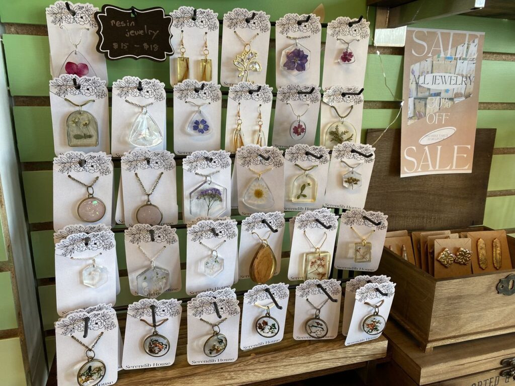
Did a little editing at my shop on Saturday — I was feeling like the jewelry was so much of a jumble that I thought it was hard for customers to see the jewelry well. So I’ve pulled probably 75% of it, and I’ll mostly have Eliana add that to the online shop (probably next week, this week is too busy with launch prep).
I also added little signs! I think that helps, right? To have at least a sense of the price when you glance at that part of the display, and not have to turn over the card to find out whether this is $5 jewelry or $15 jewelry or $50 jewelry?
I’ve gotten a prettier card (Etsy) that I’m using to feature the pressed flower jewelry, and I think they pop nicely on it, and the clay jewelry has stayed on the brown kraft card stock, so it feels nice and distinct and serene. Better!

