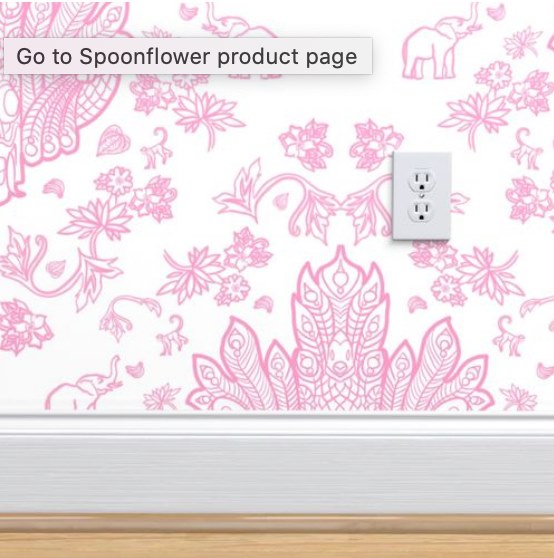
I think I managed the repeat without any little annoying white lines in the middle, yay. So, I’m not sure if there’s really any reason to design it as a repeat, rather than as a motif and have Spoonflower do a half-drop? The latter is much easier, but I *think* with a designed repeat, it’s less likely that a customer will end up with accidentally not ordering enough, but I’m just not sure. Honestly, the math of surface design kind of eludes me a lot of the time — I really do want to take a little online course for it, learn more of the basics properly.
But that said, this is the CUTEST wallpaper — “Mayura Raksha”
It’d be great in a modern South Asian-inspired home, maybe in a pretty powder room? I’m picture lots of white Victorian furniture (pedestal sink, etc.), and a bunch of hanging greenery. It’s also be delightful in a conservatory, if one had such a thing. I’m really picturing it with lots of lush plants. Ooh, or a nursery!
Now to go play with color….


