And I don't know if, when the open shelving goes back up, that will lessen the effect and harmonize it (which I'm hoping, which was the original plan, to have the wallpaper peeking out behind the items on the open shelving as a subtle counterpoint), or if the shelves will make it even worse. I have this vision in my head, but I'm not positive the end result will match that.
It's too late now; we've spent the last of our kitchen renovation budget on it, and will have to live with it regardless. It should still be functional even if the aesthetics aren't what I hoped. I'm still going to keep stressing about it at least until it's finally painted (in Benjamin Moore's China White) and the shelves are back up and filled. This halfway stage is confusing as heck. (Will add annotations on the photos individually.)

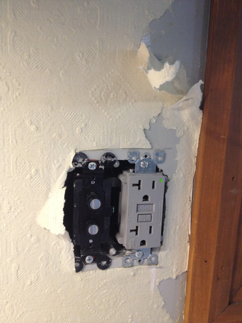
Previous anaglypta coming down -- definitely not waterproof enough; it just peeled off the wall near the sink. What was I thinking?

Wall with the shelves taken down (mostly) and wallpaper removed.

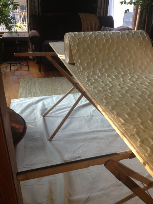
Elizabeth being rolled out, preparatory to cutting/soaking.

Dale (excellent installer, very knowledgeable) soaks the lincrusta in water, wraps it in plastic, and lets it soak to saturate. He explains that it's still going to crack as he installs it, and that he'll just fill in the cracks as needed, and that the seams won't be visible after installation and painting.

Came home from work to see it half-up. At first glance, loved it; very striking.

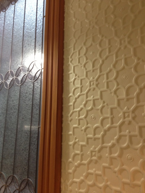
Here's a close-up of the lincrusta against the art glass. Sometimes I love it; I intended the interplay of pattern, which look like different types of stars to my eyes. But maybe it's too much.

This I really like. The lighting makes the lincrusta look close to the final painted color, and I really like how it looks against the old-fashioned push button metal plate. If I have to have outlets, this is as good as I can get, I think.

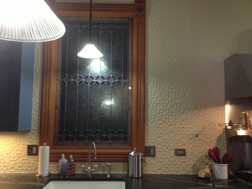
View from the living room. The paper is much yellower than the end result should be, so try to imagine it closer to the ceiling color. The goal was to have the wallpaper relief pattern be subtle, and have the art glass still stand out as the main focal point in the room. I don't know.

Closer-up. Good? Bad? I just can't tell right now. I suspect I'm just going to have to wait for the finished result.

I think the paint will help. Right now, the pattern is all I see when I look at them, and the art glass I barely look at. The paint will help tie it together with everything else and balance the overall effect.
I really like it! I agree, though, it will look even better when painted.
As an aside, do you have a Blue Star range? How do you like it? I’m considering one for a mini renovation of our kitchen.
Ours is a Wolf range; I like it.
Thanks for the feedback, guys!
I like it very much. Quite different than anything I recall seeing. What I notice most strongly is how the appearance of the print changes as you approach the wall. The “pebbled” appearance from a distance transforms into a much more formal look up close.