We'd originally thought a simple diamond-pane idea would work, with a mix of different types of obscured glass, so it'd still let in light. (Kev thought maybe some clear panels too, to let in more light, but I think that would just bug me, to stare directly at the yellow brick). I was a little worried that it would feel too Tudor / medieval (that's a very old style, the diamond pane), but Pam thinks it looks modern, interestingly. And Gothic Revival was certainly a Victorian era, although I think not quite the same era as my house. Still, there will likely be some medieval-style pieces scattered around the house regardless, especially given my obsession with King Arthur (and kingliness in general). Thankfully, Victorians are very forgiving of eclecticism -- more so than either Prairie or modern styles, I think.
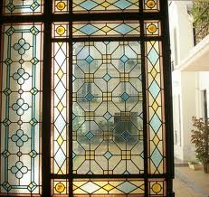
So then a simple diamond-pane, or something a little more complex? I thought possibly it would be nice to have some gothic arches at the top, to echo the idea for the butler's pantry and the piece I built for the dining room, but I'm having a hard time finding a photo that looks like that. Or if they do, the arches are made out of stone, on an old Gothic cathedral. :-) Maybe we should just stick to diamonds, with a simple rectangle border? I'm just not sure. Here are some pics that appealed to me -- what do you think?
- This is a pretty classic diamond pane, with a double border of rectangles. So picture this in non-colored obscure glass, in a variety of types (seedy, water, etc.). (Maybe with a mixed-blues border.) Right now, that's what we're leaning towards.

- Same thing, but clear glass.
- This one doesn't have the diamond pane, but does show the gothic arches at the top.

- This one combines diamond pane with a rounded arch at the top. I like it, but I think you'd have to build the window that way, no?

- A fancier version of the diamond pane, with little square jewels at the interstices.

- Here you see a combination of diamonds and lozenges, both as a design, and built out as a mirror.


- And these are just pretty. But notably more elaborate, which I think might look sort of fussy for this window.


I vote for number 4, the diamond pattern that’s a little fancier. The plain diamond pattern looks too much like security fencing, to me.
Good luck and have fun!
Could you do something different? Like a greenhouse window? That’s what I’m eventually going to do in my kitchen….
Not at this stage, Catherine. We had thought about a greenhouse window, but eventually decided against it — I honestly can’t remember why. Although partly it may have been that the plants would have gotten almost no sun, with the two building walls so close to each other.
Hoo boy, I’ve got to learn to read blogs from the bottom up up. My comments are in the next page.
Belatedly: I agree that 4 and 5 are nice, but I think I like 1 best. Agreed with Ingrid that the plain glass diamond pattern (#2) looks a bit too much like some kind of security bars.