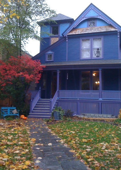
In the meantime, here's a preview of our house -- I love the pop of the orange pumpkins, the turquoise bench, and the dark red burning bush against the deep blue of the house.

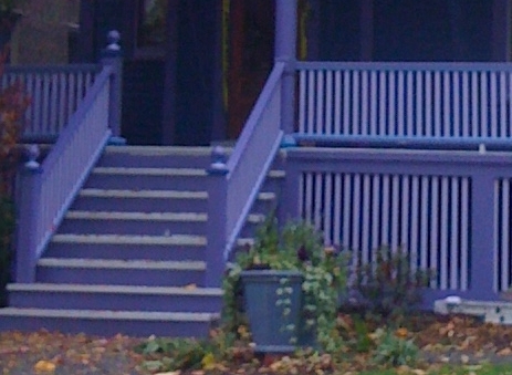
The porch colors are still a work in progress -- it's reading a bit overwhelmingly purple for our tastes. The biggest visual effect would come from changing the pillar color, but I can't find another color that I think would work well there, and the dark purple on the pillars does carry down from the dark purple on the vertical trim boards on the upper parts of the house, so I'm hesitant to change that:
Hmm...I just realized this is an oldish picture -- one change we've made already is that the front part of the steps have gone to dark blue instead of dark purple, which is an improvement. And the trim frame around the lower spindles has also gone to dark blue, again, a huge improvement. But it's still too purple overall. I would go out and take an updated photo, but it's too dark out right now! :-) Will try to update it later.

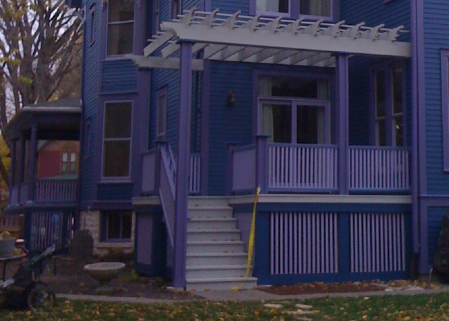
Oh wait -- I found a photo of the rear of the house after that change was made. So you can see how it looks here, with the lower trim frame in dark blue:

I've already decided to paint the upper trim board just under the porch floorboards throughout the house in the same light grey as the porch, as we did on the rear porch (you can see the difference if you compare the rear porch floor with the bit of front porch floor you can see at the far left of that photo). Better, I think, but it's still reading as too purple overall.
What else do you think would help mute the purple while still working with the rest of the house? Paint the upper spindles grey? (Kev's thought) Paint the railing dark blue? (Mine)
And hey, while we're looking at the rear of the house, a few more questions:

- is that light grey on top of the pergola too choppy? It's the same grey that's on the floors of the porches, and was meant to echo the grey on all the roofs, and the silvering cedar shingles up above, but Kev is worried that it's too light, and looks odd. Try to picture it with roses climbing on it, probably white? (But maybe red.)
- the porch pillars in back are shaped differently than the ones in front, and they have the inside bits routed out. Should we add a vertical line in a contrasting color? Maybe the grey, to tie it to the roof of the pergola? Or the light purple, the way it's used inside the window trim? (But Kev doesn't love the light purple as a color, it turns out.)
Whew. So many details and options. It's a little overwhelming.

It’s hard to tell from the photos, but the grey in the pergola looks like a primer color to me. It was good in small quantities, but as a big swatch it looks like something that still needs to be painted. But that may be the photo. I don’t think the colors are coming through very well on my computer.
I know you’re using purple on the front porch pillars to echo all the vertical purple detailing elsewhere. My overwhelming feeling, though, was that you need the dark blue in the pillars to connect the top and the bottom of the house together. In the back, the actual paint color by the back door makes the connection. In the front, the porch is so deep that the wall color behind the porch looks like a new and darker blue color, so it doesn’t serve to make the connection. So to me, you need something to bring the blue downward or it looks kind of like a sandwich.
I’d also like to see some more of the bright light blue down low on the house. Maybe on the porch spindles? But maybe even more on the borders around the porch, coupled with some light blue on the lowest level of spindles (or supports).
But all this is with the proviso about the problems with photos and computer color. And, you know I have no personal affinity to either blue or purple…. 🙂
I like the color of the burning bush against the house and think you should find some roses about that color for the back pergola, and also for the border in front of the house. Maybe mixed with a lighter pinky-peach rose.
Oh, I forgot to say that actually the house looks lovely and all my comments are tinkering with details. I always like to think of variations on themes…
The burning bush is wonderful. My favorite part of the whole thing, I think. I like Kirsten’s ideas about future flower colors.
Your whole colour palette is so cool that to me it feels like it needs a warm accent in the details somewhere: a deep red or burgandy, a nice rich brown, something like that. I like the blue and purple, though.
I agree that on the computer at least, the grey looks like its not yet painted. You like the look of the pumpkin and bush against it. I think you should take a bold, different color like dark pint or lighter green (not lime but not as dark as your purple and blues) and use it for tine details. Not in a big are but as tine little spots of color that ca n also bring out the details in the architecture.
Everyone, thanks for all the advice! Kev thinks we should just live with it until spring, and then fine-tune any changes then. Since we’re almost out of decent painting days anyway, that seems to make sense (it snowed yesterday!). But I’m going to file all of your lovely thoughts away in my teeny tiny brain. Or possibly make notes on a separate sheet of paper. Internet paper, i.e., a file. Okay, now I’m just babbling. But thanks!