I’m thinking about how markets shape products, specifically re: poetry and surface design.
I used to do slam poetry, when I lived in the Bay Area. There was this coffeeshop that hosted slam nights, and you’d go and compete with a 3 minute or less poem, and if the audience applauded the most for you, you got a pot of cash for the night, collected from people’s entry fees. It was fun, even exhilarating, but after a while, I stopped, mostly because I didn’t like what it was doing to my poetry.
It became clear, after you’d been there for a while, that there were certain things you could do to get bigger reactions from the crowd. Types of material, styles of delivery, etc. And there was nothing wrong with the poetry that created, but it was a narrow band out of all poetry could be, and it mostly wasn’t the voice I wanted to write in. So I stopped writing it.
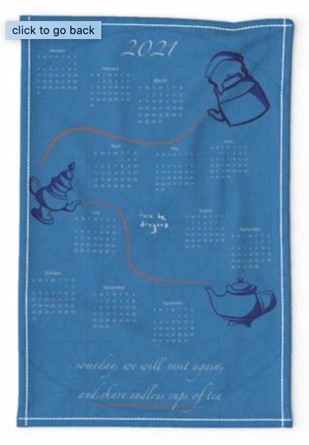
I was noticing something similar in the calendar tea towel challenge this week. The way I use tea towels is to hang them on my stove handle or dishwasher handle. So I’m always a little frustrated when I bring home a tea towel and realize that oh, that beautiful design, it’s going to be half-hidden, and the most interesting part is on the top half, which we won’t see at all. So if I were designing a calendar tea towel for my own kitchen, I’d want the calendar part (which I’m not interested in) at the top, and the design on the bottom half.
BUT, some people want the calendar part more, that’s why they’re buying a calendar tea towel, I assume, so they can glance at it and figure out the date? I could design for them.
AND, the way Spoonflower displays things matters too. For the tea towel challenges, it shows the whole tea towel, which means you need an image that’s graphically strong when displayed small over the whole towel. If I were just designing for my own usage, I’d probably put the calendar on the top with some minimal design, and a strong graphic on the bottom half.
No real conclusions here, just pondering. I’m a big fan of functionality in design, and it’s making me realize that as much as I like my overall image for the tea towel challenge, I kind of want to redesign it to have the calendar at the top, and the graphics below. Maybe two versions is the way to go.
That’s more work, though, and there’s another challenge for this week… ![]() Tea towel ABC’s — I’m thinking of doing Tamil vowels for mine.
Tea towel ABC’s — I’m thinking of doing Tamil vowels for mine.