Eat-In Renovation
Sometimes it's just a paint job and some new art.
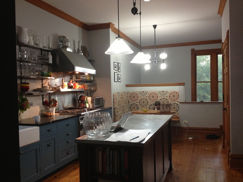
This is our kitchen and eat-in area (above the mudroom) as it was last year. We'd done the walls all one color, but the kids were totally hacking the light grey paint, esp. where they ate, and going down the stairwell (not pictured, to the right) to the mudroom. It looked horribly dingy within three months of the original paint job.
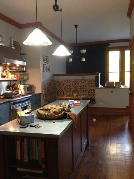
We'd loved Farrow & Ball's Hague Blue when we put it in our living room, so we decided to try it in the eat-in. I was a little worried that it would make the space feel less airy and open, but it seemed worth the trade-off if it looked decent for a longer stretch.
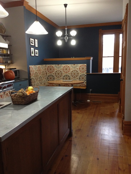
Here it is fully painted, and I've got to say, LOVE IT. I like having a clearer demarcation between the eat-in/mudroom and the kitchen -- even though it's open plan, it feels a bit more like two separate roms. The eat-in area feels cozier now, sort of snuggled in, if that makes any sense.
After binging on kitchen photo galleries on sites like
https://howtohome.com/, I'm still a little tempted to add a piece of wood trim on that corner between the two; just switching paint from one to the other feels a bit modern? Not in keeping with the Victorian feel of the house. What do you think? It could be a rounded skinny piece (like a thin bumper), or a wider thick piece (like the door and window moldings).
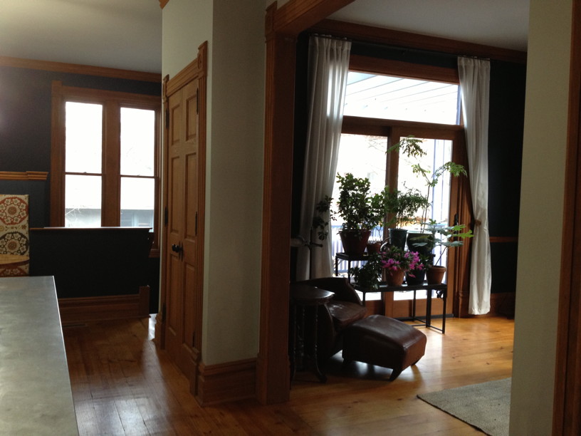
Here you can see the color changes -- the Hague Blue of the eat-in/mudroom, the pale grey (F&B's Pavilion Gray) of the kitchen, and then the Hague Blue again in our living room. We were worried that it would be too much of the same color, but there's enough separation that I think it works. And even lends a certain coherence.
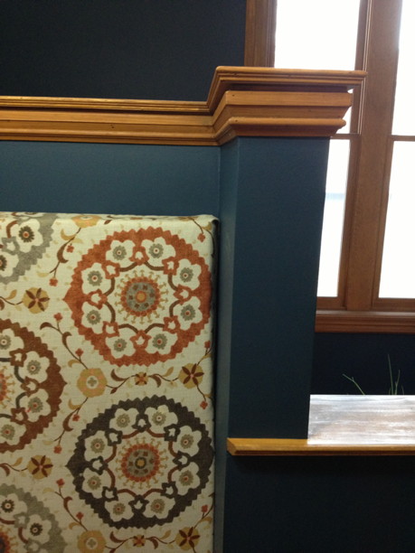
I LOVE the way the fabric of the seat-backs pops against the blue paint. It looks SO MUCH BETTER than it did against the light grey. And our trim works well with it too (which we knew, from the living room); I really like that dark honey wood against the deep blue.
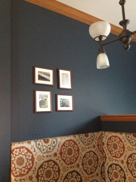
I had four little Sri Lanka tea photos of mine matted and framed over there -- they were nice photos, but the scale felt off. The pics were too small for people to really notice them, unless they were willing to stand up on the bench and peer at them, which none of our guests ever did. :-)
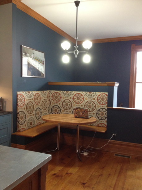
This is what it looks like now -- I took one of the tea photos and blew it up to 24x36 (I think), and framed it (thanks for the inexpensive frame, Michaels!), and hung it. I like the single large photo a lot better in that space -- feels unified. My only waffle now is whether it would look better if placed a little higher -- right now, it's where I could reach to hang it. :-) If it went up, it might read more as on a plane with the upper part of the mudroom, if that makes sense.
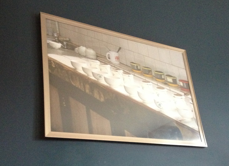
Close-up. :-) It is HARD to take a good photo of a photo behind glass -- the light reflects like crazy. From the Pedro Tea Plantation in Sri Lanka, teas for tasting.
The image itself is here.
 This is our kitchen and eat-in area (above the mudroom) as it was last year. We'd done the walls all one color, but the kids were totally hacking the light grey paint, esp. where they ate, and going down the stairwell (not pictured, to the right) to the mudroom. It looked horribly dingy within three months of the original paint job.
 We'd loved Farrow & Ball's Hague Blue when we put it in our living room, so we decided to try it in the eat-in. I was a little worried that it would make the space feel less airy and open, but it seemed worth the trade-off if it looked decent for a longer stretch.
 Here it is fully painted, and I've got to say, LOVE IT. I like having a clearer demarcation between the eat-in/mudroom and the kitchen -- even though it's open plan, it feels a bit more like two separate roms. The eat-in area feels cozier now, sort of snuggled in, if that makes any sense.
After binging on kitchen photo galleries on sites like https://howtohome.com/, I'm still a little tempted to add a piece of wood trim on that corner between the two; just switching paint from one to the other feels a bit modern? Not in keeping with the Victorian feel of the house. What do you think? It could be a rounded skinny piece (like a thin bumper), or a wider thick piece (like the door and window moldings).
 Here you can see the color changes -- the Hague Blue of the eat-in/mudroom, the pale grey (F&B's Pavilion Gray) of the kitchen, and then the Hague Blue again in our living room. We were worried that it would be too much of the same color, but there's enough separation that I think it works. And even lends a certain coherence.
 I LOVE the way the fabric of the seat-backs pops against the blue paint. It looks SO MUCH BETTER than it did against the light grey. And our trim works well with it too (which we knew, from the living room); I really like that dark honey wood against the deep blue.
 I had four little Sri Lanka tea photos of mine matted and framed over there -- they were nice photos, but the scale felt off. The pics were too small for people to really notice them, unless they were willing to stand up on the bench and peer at them, which none of our guests ever did. :-)
 This is what it looks like now -- I took one of the tea photos and blew it up to 24x36 (I think), and framed it (thanks for the inexpensive frame, Michaels!), and hung it. I like the single large photo a lot better in that space -- feels unified. My only waffle now is whether it would look better if placed a little higher -- right now, it's where I could reach to hang it. :-) If it went up, it might read more as on a plane with the upper part of the mudroom, if that makes sense.
 Close-up. :-) It is HARD to take a good photo of a photo behind glass -- the light reflects like crazy. From the Pedro Tea Plantation in Sri Lanka, teas for tasting. The image itself is here.
