
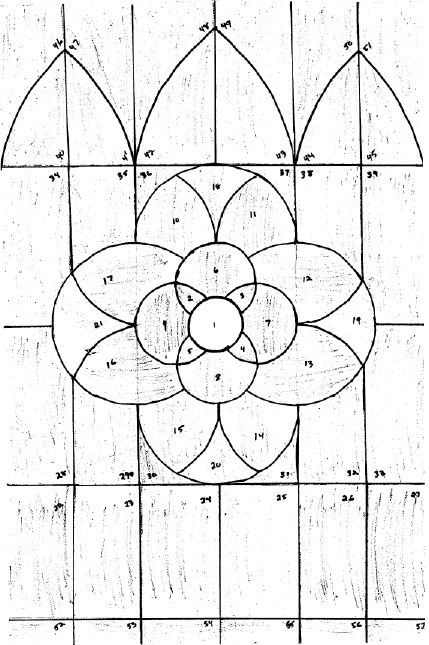
I'm reasonably happy with the pattern, but I do wish I'd taken that border of rectangles at the bottom and run it all the way around the piece, shrinking the rest to fit. It would have given it a more traditional and finished look. Ah well.
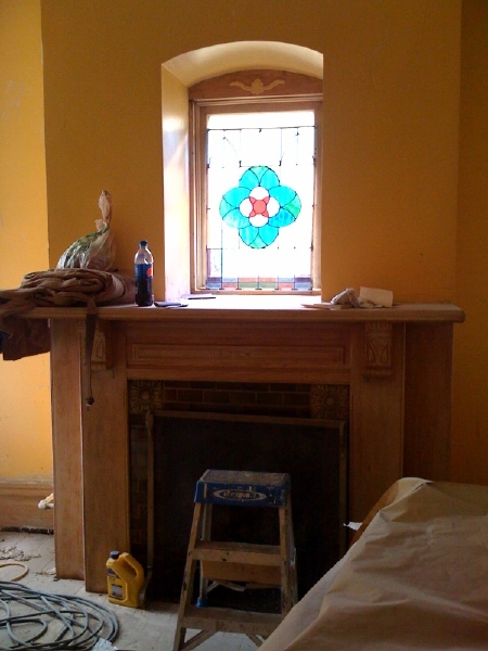
Below is the piece, propped up in the window. When it's installed properly, it'll be two inches higher, filling the space.
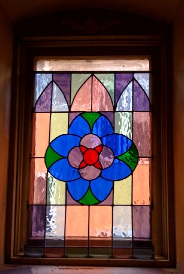
And here it is close-up. It was my teacher's suggestion to use richer tones in the center and paler in the border, to make the central motif pop. It certainly pops, but I'm honestly not sure if I like it -- I sort of wish I'd done it all in the rich tones. Though this will let through more light, at least. Thoughts?
And this is the new pattern I designed, modelled on rose windows. It's for replacing the foyer stained glass window that I don't like.
I've cut out the pieces of paper, taped them to the glass, and am in the midst of cutting the glass. I hope to finish glass cutting at studio today (2-4), and then start leading tomorrow at class (1-3). I think I like this pattern -- it's not quite as perfectly symmetric as I'd planned, but ah well. And it ended up more of a star than a rose -- a star-rose hybrid? I kind of like that, actually.
Onward!
There is actually a variety of roses with Star in the name.
Here is a link to the Canadian White Star Rose. It is very pretty!
http://www.helpmefind.com/rose/l.php?l=1.933
I think the window is beautiful, and can’t wait to see the Star Rose when you have it finished and posted. =)
The window is pretty! I like it.
I think richer tones on the border could also have worked well, but I do quite like the effect of the center popping out.
Hi Mary Anne,
I know you have a little artist’s remorse here, but I agree with the teacher that the paler tones allow the center to really shine. I like the geometry of the pattern, it feels satisfying without being too complex. I also think lighter glass will allow for more light to shine through. Jewel tones are overpowering and would probably dominate the entire room if you had done it that way. Do you think there’s a way to model your designs prior to putting in the glass so you get a better sense of the final outcome(colored pencil on tracing paper, then put up on a window)? I have noticed with art pieces that the more time I spend planning and doing mock-ups, the more satisfied I am with the final product. But I too get impatient with that part since I love a finished product. That said, my first impression of this piece was that looks beautiful and I love it in the space!
Mary Anne,
I agree the rich tones in the center with a pale surround is good. Having seen a number of old stained glaas windows in Europe, I believe you’ll be happy when on a late afternoon the sun will project the pattern onto the wall or floor and it will be really colorful like a painting. I do think that the perimeter should have gone all around.
It will be exciting to look around the house when it’s done and see how much of your own input is visible.